
A product has been added to the basket
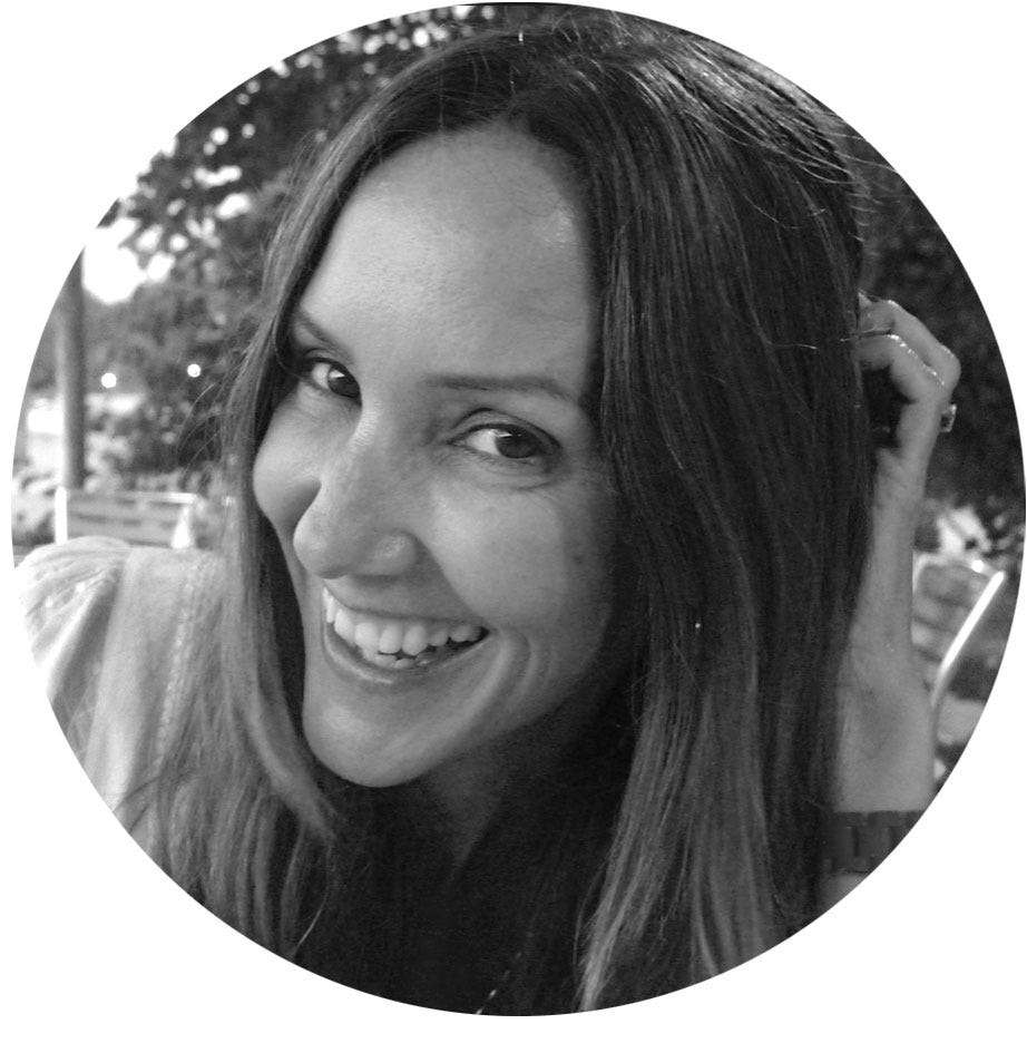
Interview with Alison Carmichael - Handlettering Artist
Interview with Alison Carmichael - Handlettering Artist
The art of handlettering is still alive and well. In fact, it has been going through a bit of a resurgence following the prepoderance of digital typography. Even the big brands are approaching the handlettering artist to bring more personality and warmth to their branding. We have been following this trend for a while, and have discovered a wonderful artist called Alison Carmichael who we were very lucky to interview about her work and career.
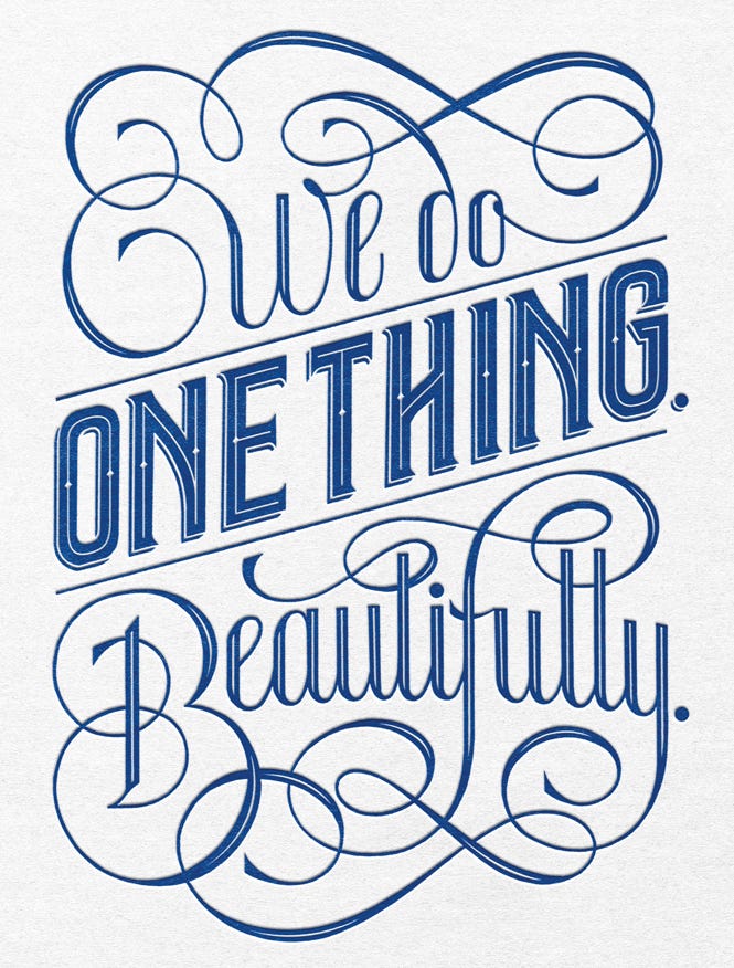
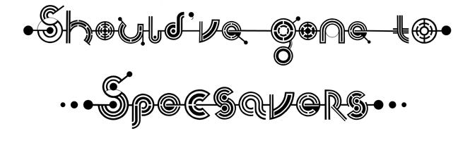
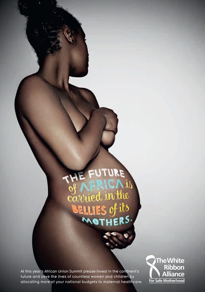
Alison has been working commercially for over 15 years for some very high profile organisations such as; Time Out, McDonalds, Specsavers, the White Ribbon Alliance. Having graduated with a degree in Graohic Design from Ravensbourne college of design, Alison has developed a playful and diverse approach to media which has included ketchup, shampoo and treacle.
You’ve been working with lettering for almost 15 years. How did you turn a passion for lettering into a career?
I studied graphic design at Ravensbourne and in my final year I specialised in hand lettering and decided that I didn’t want to be a conventional graphic designer. After graduating, I got together a portfolio of my hand lettering and trudged around all the London ad agencies trying to see if there was still a market for hand lettering in what was really a time where everyone was embracing type design on the Mac. Luckily for me, I discovered that bespoke type treatments still sometimes required hand crafting and very slowly I started to build up my client base and it sort of rolled out from there.
“What piece of advice would you give to an aspiring hand lettering artist?”
Advice I would always give to aspiring illustrators/ lettering artists is to try to stay true to your own aesthetic. We are deluged with references from online blogs and design websites and it is very easy to be heavily influenced by what other designers are doing. That is a common mistake that young illustrators can often make. It is really important to create and nurture your own style of work so that you are distinctive and memorable. The best way to do that is to just keep drawing, painting, writing, collaging, charcoaling, carving and trying out all different methods and mediums to create different looks.
How do you approach your projects and where does your inspiration come from?
As an artist I am inspired by everything! I am naturally interested by anything hand created or crafted or historical, all types of design and illustration, found hand writing and doodles and I collect files of reference to use when I start a project. When I am commissioned by an ad agency or branding consultant, the direction is usually pretty concise. I am usually given some visuals as a starting point and then I go off and look through reference material and then I start sketching ideas which get refined as the process continues. There is a lot of to-ing and fro-ing between artist and client before we get to a final place. It is important as a commercial artist to learn to understand and take direction well.
Which project you’ve worked on are you most proud of so far?
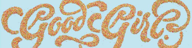
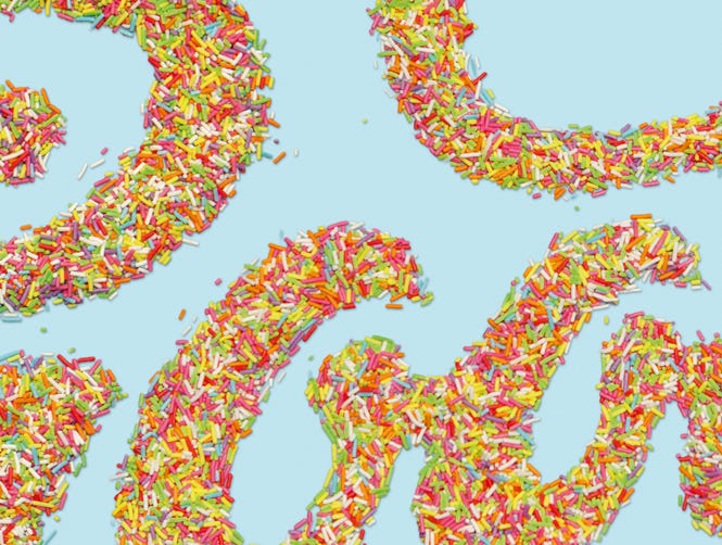
A really hard question to answer as so many of my projects have been exciting milestones in my career. I was recently part of an exhibition called “There’s a Good Girl” organised by Saatchi and Saatchi and Vivawomen where female artists were invited to produce a piece of artwork with reference to the title of the exhibition. I was given the format of a 96 sheet billboard poster situated behind the agency. That is about 4 metres high by 12 metres long to put it in context! I created and photographed the words "Good Girl" made entirely from multicoloured sugar strands. It was exciting for me to be given a huge scale format to do whatever I wanted with.
What are some of the more unusual materials you’ve used with your writing?
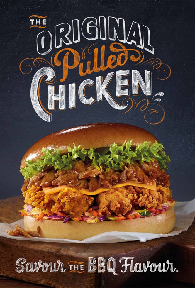
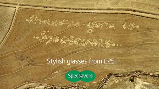
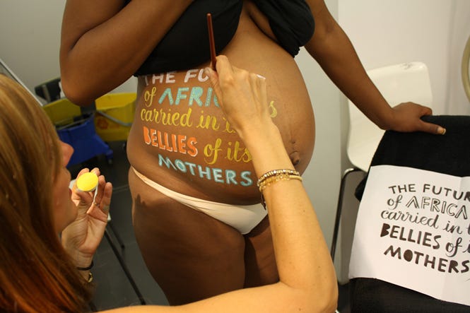
I’ve been commissioned to create typography with all kinds of materials - carved in wood, painted on skin, loose leaf tea, marmalade, ketchup, shampoo, treacle, sugar strands and recently wheat and pumpkin seeds for a cracker brand. The largest piece I have ever created was full scale crop circles in a field in South Africa.
How do you maintain such precise work when using these materials such as ketchup, shampoo and treacle?
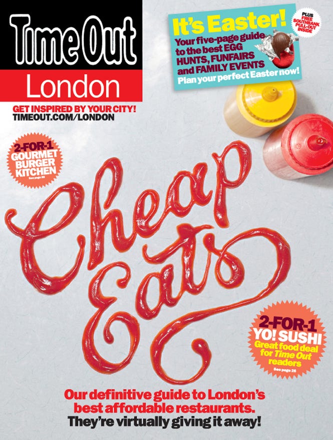
Aah, it’s all about scale!! With something like the ketchup on the cover of time out for the “cheap eats” issue, it appeared that the lettering was about the same size as a normal dinner plate. It was, in fact much bigger than that and resized digitally. I created the artwork in pencil on paper and then enlarged it and printed it out at the size I wanted to create it. Then I used graphite rubdown paper to create a feint outline of the lettering on the surface that it was being photographed on and then carefully filled and built up the shapes of the letters using the wrong end of a teaspoon - So no clever digital trickery there!
What are your plans with your work for the year ahead?
Without wanting to sound cagey, I’m not really allowed to speak about any of my current or upcoming commissions until they go live which can take a long time so that is a bit tricky for me to answer that specifically. I can say that I’m working on a really exciting Christmas campaign for an American fashion retailer. I intend to carry on working hard, hopefully continuing to evolve my portfolio of styles! That is the great thing about being a hand lettering artist - the scope of work is limitless, challenging and really varied - it never gets boring!
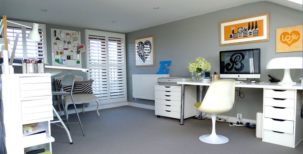 Alison's Studio
Rollerball vs. Ballpoint Pens: A comparison July 17, 2013

Refill Guide September 2, 2015

Fountain Pen Nib Width Comparison August 4, 2015

Lead Sizes for Mechanical Pencils October 19, 2015
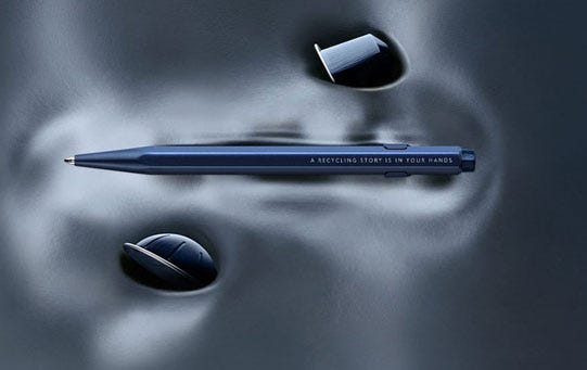
Cutting Edge - Unconventional Pen Materials April 18, 2024
Egg-straordinary Stationery March 21, 2024
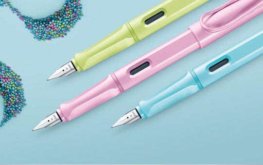
LAMY safari's Spring Awakening April 26, 2023
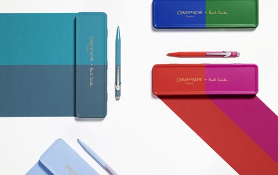
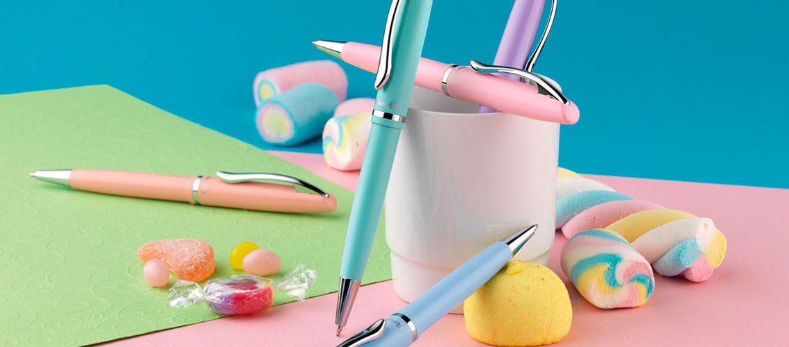
Flair for Fashion March 8, 2023
Comments